Summary
- The Google Play Store app on Android has adopted a new design for bottom sheets, resembling Google Maps.
- This is one of the rare instances of the Play Store adopting new UI design guidelines, like Material Design 3 progress bars, alongside other Google apps.
- The new bottom sheet design features rounded corners, variations in text size, and a handle to expand the sheet.
The Google Play Store is the default App Store on most OEM Android ROMs, including stock Android running on the company’s Pixel phones. However, it doesn’t usually abide by the latest Material You design guidelines. Although most Google Workspace apps are quick to adapt, the Play Store rarely features the latest design elements. Now, we’re seeing the Play Store app on Android adopt a new design for bottom sheets, hot on Google Maps’ heels, which picked up this change earlier this month.
Google Maps overhauls its navigation experience with a redesign
More cards? Yes, please
Recently, there have been rare instances where the Play Store was among the first few apps to adopt new UI design guidelines, like we saw with the Material Design 3 progress bars introduced in January. However, app evolution is a constant process because Google regularly amends Material Design guidelines which app developers have to abide by.


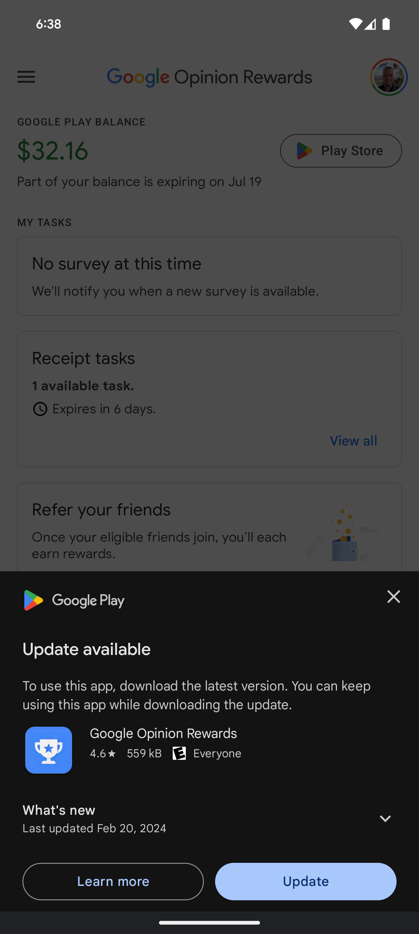
Current bottom sheet design in the Play Store
This isn’t evident in the bottom sheet design used in the Play Store, which still features straight edges and lines to demarcate sections. The design has remained relatively unchanged for a while, but Google app feature spotter AssembleDebug on Telegram has noticed a new bottom sheet design in Play Store version 39.8. This new design is a lot like the one on Maps, featuring rounded corners all around, and variations in text size and weight to differentiate sections. The design also has a new handle along its upper edge to drag and expand the sheet to fill the screen.
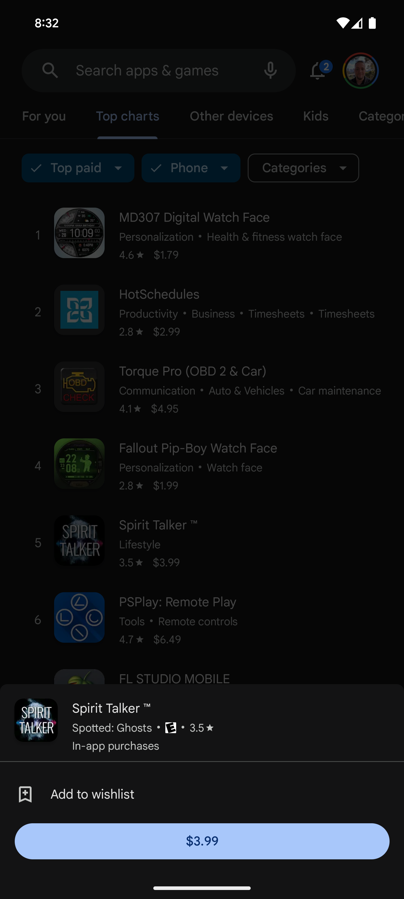
New bottom sheet design in the Play Store
Such bottom sheets show up when apps prompt you to update, or when you try installing them from your Discover feed and promotions. The smaller bottom sheet with fewer details which appears when long-pressing an app listing on the Play Store also features rounded corners and the handle characteristic of the new design. The design also extends to the Featured Stories section, which shows up on the installation page of an app, if applicable. This section contains recommendations for apps from similar categories, curated by the Play Store.
This noticeable change should help the Play Store blend in with other contemporary apps, especially from Google. However, you may need to update the Play Store manually for the changes to show and version 39.7 appears to be the latest stable build.

Alex Mitchell is your go-to expert for all things mobile. With a passion for the latest smartphones, apps, and mobile innovations, Alex provides in-depth reviews, insightful analyses, and breaking news about the ever-evolving world of mobile technology. Stay connected with Alex to navigate the fast-paced realm of mobile devices.


