

I was lying in bed, scrolling on my phone (instead of writing), when I decided to check Discord. To my surprise, I was met with a message. Discord was changing its mobile UI structure, providing a whole new user experience through the app. Hooray?
The change was automatic, so I could start using it right away. And boy, did I hate the update. I tried to give Discord’s new mobile UI a chance. I could see what the community management platform was trying to do. The new format siphons off servers from direct messages and provides a vibe not that dissimilar to Facebook’s Messenger.
But the Discord mobile update is just such an inappropriate change for the platform, a dire mistake that speaks to a social media company that simply doesn’t understand its core audience.
Here’s the Discord mobile update, explained
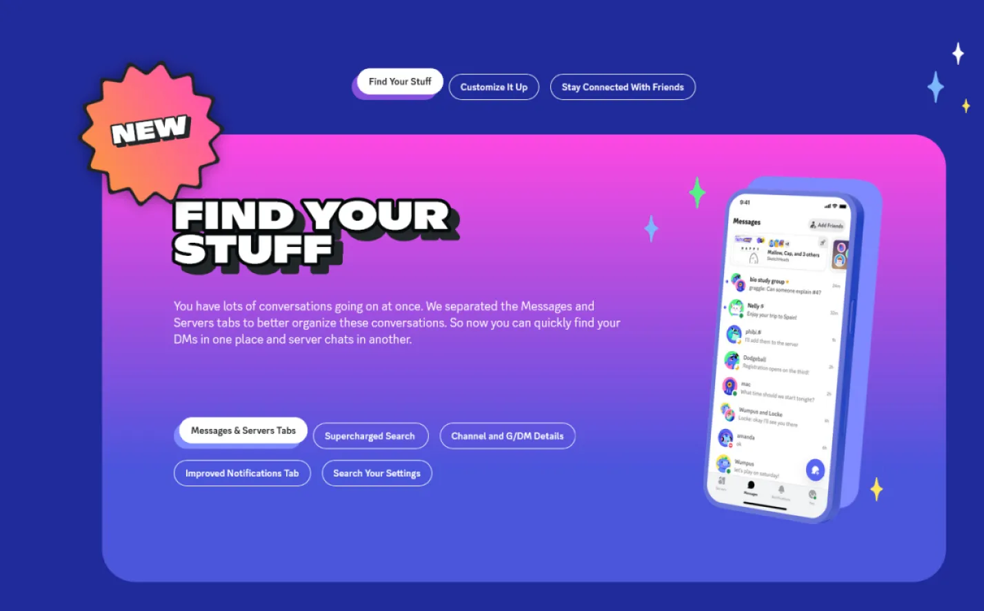
On December 5, Discord announced on its official X (formerly Twitter) account that “an improved mobile experience has arrived!” And to Discord’s credit, there’s a lot of hard work put into the new UI design. According to Discord’s official webpage, Discord has improved the ability to search for your settings, look through your notifications, and customize your mobile design theme. The voice and video call UI format has been refined, and the actual DM window sports a cleaner look. Media sharing is far more accessible too, and Discord provides some solid preview options for building group DMs.
These are all great things. What’s not great is the overall format introduced in the new mobile Discord update. Now, Discord features a main hub on the bottom of the screen with four separate tabs: “Servers,” “Messages,” “Notifications,” and “You.” Want to post in a server, then DM a friend privately? You’ll need to find the server bubble in question on the “Servers” tab, head to the channel you’d like to post in, back out of said channel, click on the “Messages” tab, scroll through various message previews to find your friend, bring up their DM, and send your message. It feels clunky, like wandering around three or four rooms just to get from the bedroom to the bathroom. The whole experience becomes even more difficult if you want to message someone you haven’t spoken to in a minute.
In comparison, the original Discord mobile format replicated the desktop Discord experience very well on smartphone: It used the same bubble format still seen on desktop, where users can easily switch from a server bubble to their DM bubble. It always felt simple, easy, minimalist, and straightforward. If you wanted to carry out the same exact series of actions on Discord’s prior mobile format, all you had to do was find the server in question on your left-hand tab, head to the channel, post, back out, scroll up to your Direct Messages bubble, click it, and find the username in question. Haven’t talked to said user in a while? No problem. A quick scroll through a series of names brought you right to your recipient. Needed to double check what’s going on in your server? You could easily swipe down, go back to the channel, swipe up, go back to the DM.
Everything more or less happened in one central hub, and most Discord mobile users spent a significant amount of time relying on the left-hand panels to chat. A seamless and simple experience was then changed into a complicated mess, all thanks to a major design issue.
Discord’s new UX makes the “event boundary” mistake
In theory, Discord’s new format features the same number of swipes and clicks as the prior UI. But the new menu design makes things feel too compartmentalized. The human mind perceives objects in separate areas as further away than they actually are, as passing through a doorway is an “event boundary.” That’s why, if you’re working from home, a coffee pot in your kitchen may feel farther away than your bed in the room with you. Even if the two objects are equidistant to you, the bed is in the same room as you, while the kettle requires an event to access it (that is, passing through a doorway).
Discord’s new menu structure works the exact same way. Whereas the prior Discord menu approach made message navigation feel gradual and subtle through a central hub, the new UI feels laborious and sluggish. Switching from hub to hub means there are simply more “events” happening now.
Yes, Discord’s original mobile menu structure never quite mirrored traditional mobile DM platforms like Telegram, Signal, WhatsApp, or Messenger. But that never bothered Discord’s core audience. Discord users are primarily gamers, geeks, and terminally online individuals. They never needed the app to look like Messenger. In fact, desktop Discord usage is a core part of the platform’s experience, given so many of us rely on Discord for coordinating multiplayer PC gaming sessions. In other words, if most of us use Discord on our PCs, it’s far better to mirror the desktop Discord UI for a mobile experience than force Discord users to accommodate to mobile-specific UX design.
I hope Discord reverses its update as soon as humanly possible. And not just because Nitro users are reportedly pulling their subscriptions, per Dexerto. I’m happy to embrace change if it makes a platform better, but I simply don’t think Discord’s design philosophy benefits users here.
(featured image: Discord)
Have a tip we should know? [email protected]

Alex Mitchell is your go-to expert for all things mobile. With a passion for the latest smartphones, apps, and mobile innovations, Alex provides in-depth reviews, insightful analyses, and breaking news about the ever-evolving world of mobile technology. Stay connected with Alex to navigate the fast-paced realm of mobile devices.